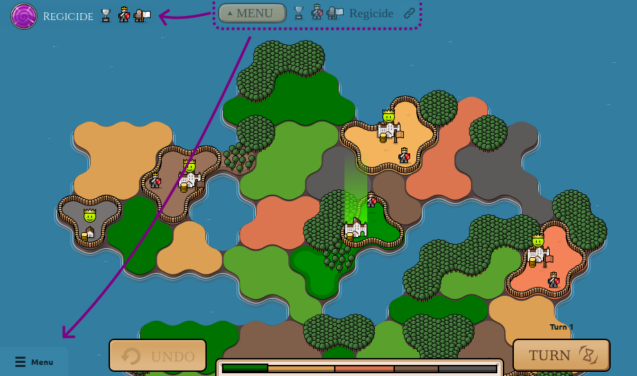
📑 New level menu!
The in-game ☰ menu button has moved to the bottom left corner and now opens an actual menu instead of dropping you out of the level! Continue reading for more on this change and future plans.

The new level menu has three main goals:
- When you jump into a new level from victory screen (“Next Island” button) or some other direct way, like with a link, you should get a nice level overview with level description, objectives and modifiers. (note: showing the menu automatically on level start in those cases is not yet implemented at the moment, coming soon!)
- With the increasing variety of modifiers and custom objectives that map makers can use, a way to review active modifiers and be able to jump to the relevant help pages is needed more and more urgently.
- The menu provides a more obvious way to change difficulty, discreetly reminding you of this option when you are about to quit out of the level. It also makes the rewind and view replay actions easier to discover.
Besides these, I also like the potential it opens for future improvements, such as:
- A place where you can reveal hints by the level creator.
- A place to access statistics about the level.
- If you have more space on your monitor than you know what to do with, a pin button could allow you to keep the level details and big restart/rewind buttons pinned permanently on the side while you play.
While adding this menu, I also decided to move the menu button elsewhere, just to keep everyone on their toes 😉. Okay just kidding, it’s mainly to achieve smoother navigation with less mouse travel. The button is now aligned in the same hotspot where you find the “back/leave” button on all other screens, saving a lot of mouse travel. It is also closer to all the other important controls at the bottom of the screen.
Next steps
In terms of konkr development, these past few months have been slower than I’d like, but also full of fun experimentation. I’m really happy to se the new map features and modifiers enjoyed by the community and used creatively by many talented map makers.
Despite the rough state of the internal map editor, there’s been such an influx of interesting new levels on discord, that the Mapmakers Archipelago has already outgrown all other expeditions. And just going through the submitted maps and picking which ones to add is taking a non-trivial amount of my time every week.
All this really highlights to me the huge potential lurking behind a user friendly map editor and map sharing system. So my current priority is clear - to unleash this potential in all it’s glory. That is:
- Polish up the map editor and make it accessible in the game to all players.
- Add an easy way for players to share their maps with the community and for the community to rate and tag them, ideally all within the game itself.
Putting the curation of player-submitted maps into the hands of the community should also free me up to focus more on new features and novel expeditions like the Dead Islands.
I will need to do some heavy lifting under the hood to get this done, so the next weeks or even months might not be very eventful, but the eventual payoff should be more than worth it!
I also don’t have as much time these days to enjoy the ever-growing discord community as I try to stay focused on the actual development. Rest assured I still read and really appreciate all the feedback and suggestions and general discussion about the game.
Thank you for reading this far and keep being awesome while I keep chipping away at the next big milestone for Konkr! ❤
